
How to apply Visual Hierarchy in Product Design
Imagine reading this article, then the title text is the same font size as the body text. It’ll be confusing and that’s a bad visual hierarchy.
In this article, we’ll go over how to apply visual hierarchy.
Visual hierarchy is the principle of arranging elements to show their order of importance.
It lets users know which elements in the design require the most focus.
The hierarchy shows the difference in the importance of the elements in a design. Colour and size are the most common ways we can create hierarchy — for instance, by highlighting a primary button or using larger fonts for headings. Items that appear at the top of a page or app also tend to be viewed as having a higher hierarchy than those appearing below.

Fundamentals of Visual Hierarchy
Hierarchy is a visual design principle that designers use to show the importance of each page/screen’s contents by using these features:
- Size — Users notice larger elements more easily.
- Colour — Users notice bright colours more than muted ones.
- Contrast — Dramatically contrasting colours are more eye-catching.
- Proximity — Closely placed elements seem related.
- Whitespace — More space around elements draws the eye towards them.
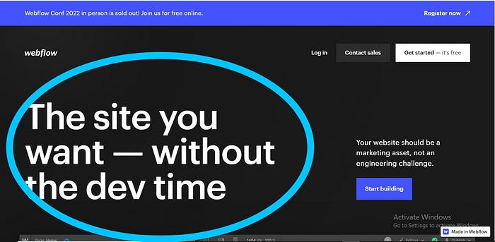
Let’s use Webflow’s Landing page as an example:

Size — Users notice larger elements more easily.
Notice the larger text in the Hero section, this shows the main idea web flow wants you to take away.

Colour — Users notice bright colours more than muted ones.
Notice the call-to-action here is a button and has a bright blue colour. This makes it attractive and stands out without taking up much space.

- Contrast — Dramatically contrasting colours are more eye-catching.
Using Black and white is a great way to achieve contrast. You can use the 60–30–10 principle to show to achieve balance when contrasting. Here, Black is the dominant colour, White is less dominant, and Blue is the dominant colour. The same principle can be applied more text styles.
- Proximity — Closely placed elements seem related.
Here, the Navlinks are placed together showing that they are related.
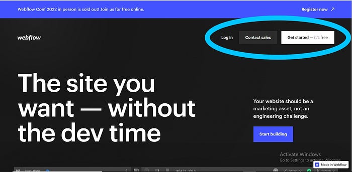
- Whitespace — More space around elements draws the eye towards them.
Notice there is a lot of space around the text, this shows how important the text is.
Other features such as alignment, texture and repetition are also paramount.
How to apply Visual Hierarchy
Here are some key considerations for optimizing your visual hierarchy for users:
- Using Gestalt principles — It helps users notice what’s important on each page at a glance. It’d confuse and delay users when elements are clustered together. Instead, group them according to their functionality.
- Consistency — Using familiar icons, sections, colours, etc. makes it easier for the user to understand and navigate (Jakob’s principle).
- Whitespace — Using whitespace means giving more space to the most important elements. It helps the user to focus on what’s important.
- Text and Colour styles — When creating your text and colour style guide make sure to identify the dominant, less dominant, lesser dominant and neutral colours or font styles. Use the 60–30–10 ratio for balance.
Conclusion
In essence, visual hierarchy is the structure for arranging well-chosen elements that must look and work best together — so users can enjoy seamless experiences and forget they’re using an interface as a medium.
Always remember, not everything in your design is important, make sure to prioritize the core message over everything else.

